Behind the story of PressIT
- PressIT Wireless Presentation System: a novel product stands out in a new business climate
- The paradox of good design being “invisible”: how PressIT functional design shapes the user experience
- Perplexed by a curious request for an “award-winning design”
- “One button, one function” for ease of use
- Packaging builds excitement with a Panasonic Blue reveal
- A paradox: good design is invisible
The paradox of good design being “invisible”: how PressIT’s functional design shapes the user experience
This interview comprises Part 2 of our exploration of the PressIT Wireless Presentation System. Part 1 is published here
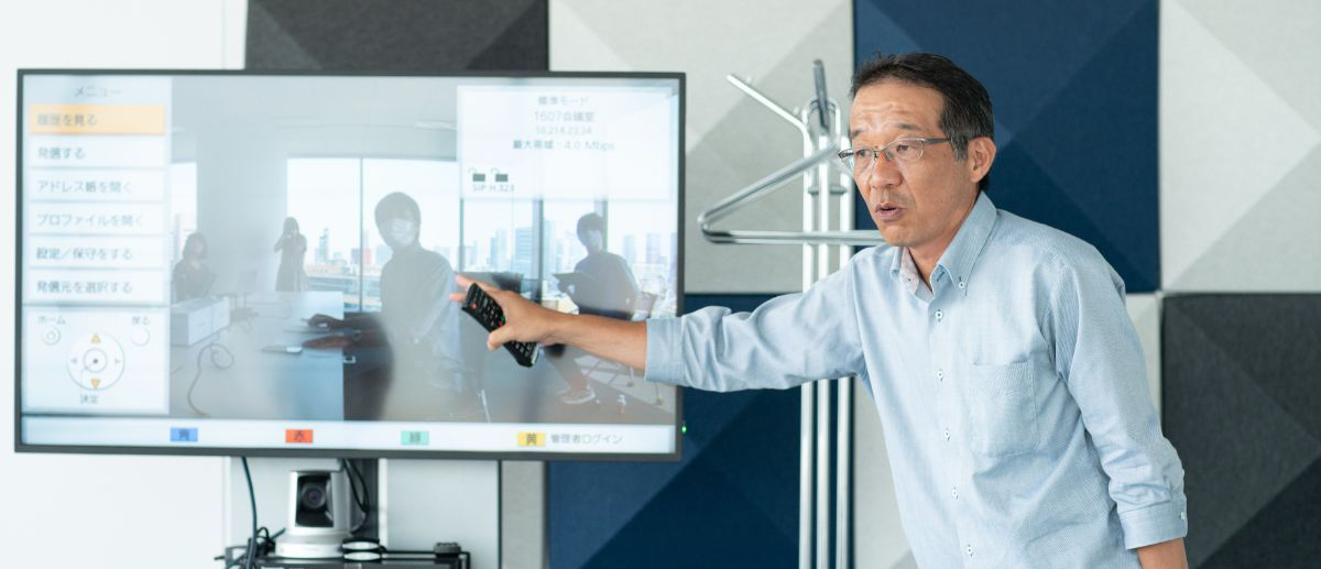
PressIT allows students, teachers, and meeting participants to share their PC or mobile screens to a display or projector via a transmitter with a single button-push. It’s no longer necessary to change seating positions, share a cable, or switch inputs with the remote controller, making any meeting run more smoothly. In addition, in light of the pandemic, PressIT promotes safe social distancing when holding meetings face-to-face.
In Part 1 of our exploration of the PressIT development story, published here [HOTLINK], the product’s lead engineer shared his perspective. We now look at how PressIT’s design evolved into the unique and easy-to-use product that launched in October 2020.
To ensure practical convenience for large groups in conference rooms and classrooms, it’s essential that the functional and operational aspects of design are easily grasped by users. Our product designer, UI designer, and logo/packaging designer were central to broadening the system’s appeal for businesses and educators. The attention to detail invested in PressIT is obvious, from the exciting unboxing experience to the look and feel of the case and the functions assigned to its two buttons.
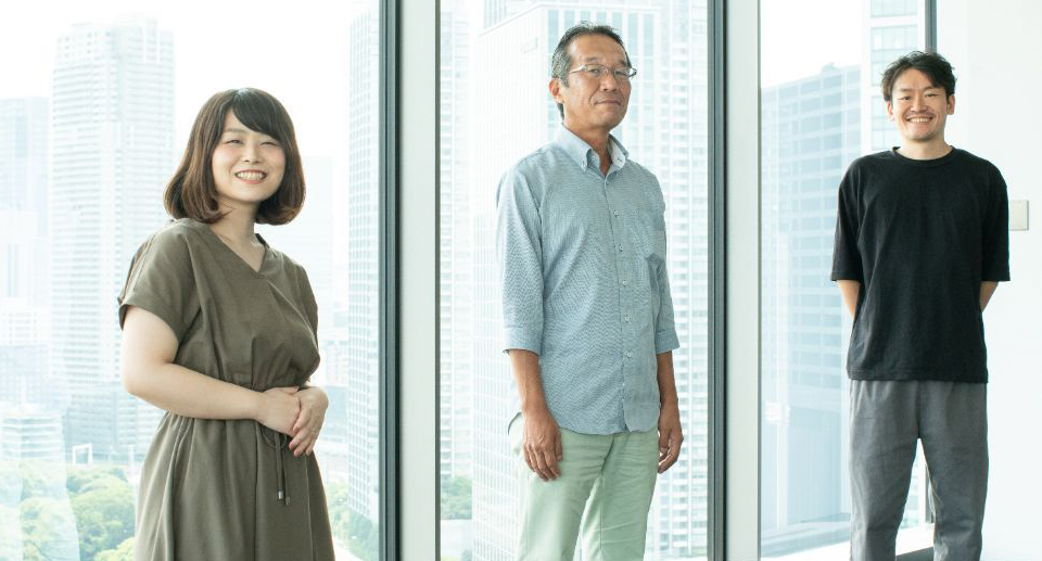
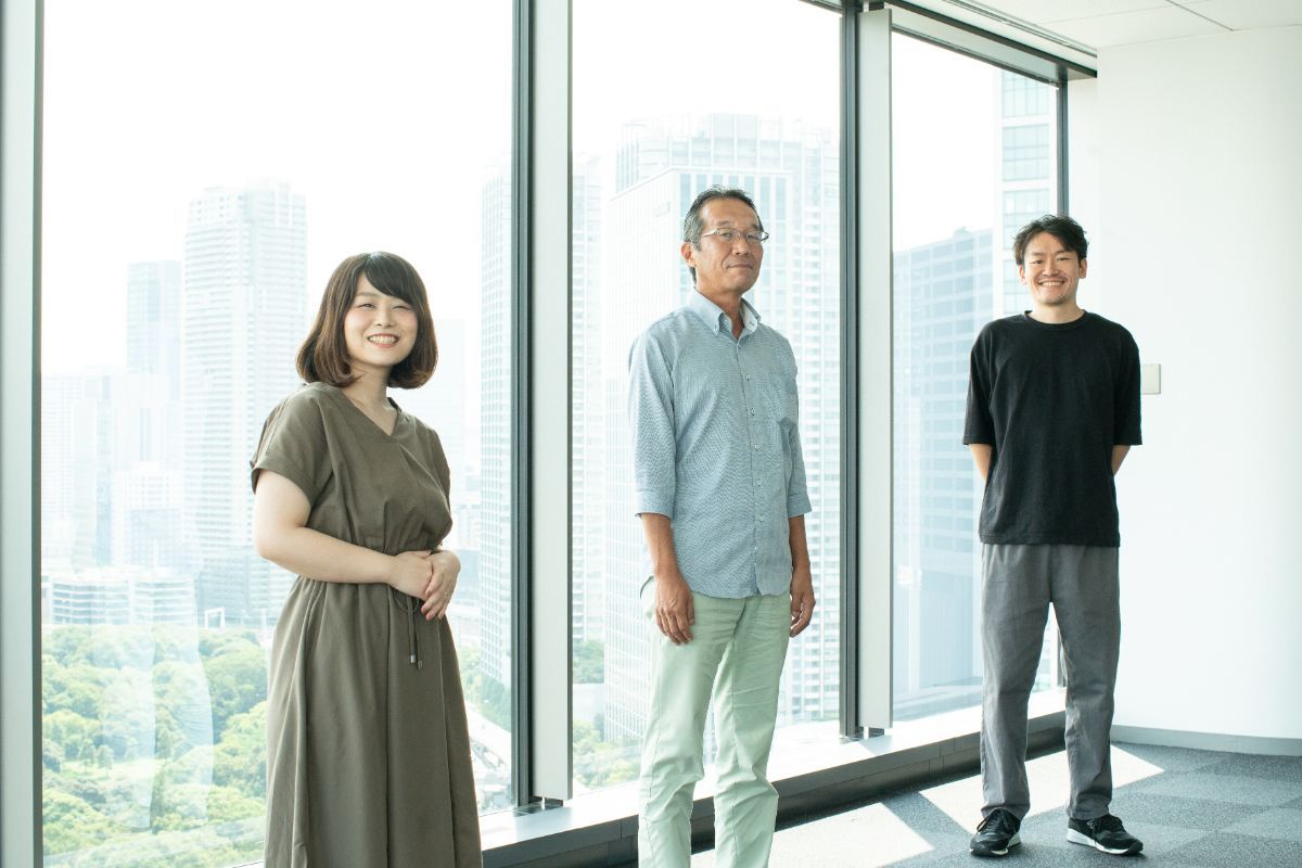
We spoke to Takashi Koyama, Haruka Imaichi, and Terushi Kimata of Panasonic Connected Solutions Design Center about the processes that led to the final product, and what aspect of their work they find most rewarding.
Note: all appropriate safety measures were taken when conducting this interview.
This edition features interviews with the following people
Takashi Koyama
Takashi Koyama was responsible for PressIT product design and device management.

Haruka Imaichi
Haruka Imaichi was in charge of PressIT’s logo and package design.
Terushi Kimata
Terushi Kimata was responsible for PressIT’s UI design.
Perplexed by a curious request for an
“award-winning design”

Can you tell us about your work?
Takayuki Kida
I’m usually in charge of product design of professional equipment. My job involves industrial design of the products we see around us, such as home appliances, furniture, and stationery.
By industrial design, you mean making products look cool, making them easy to use?
Takayuki Kida
That’s right. We also have to keep the product’s function, sales strategy, target market, and manufacturing cost in mind. The product designer also plays an important role working with other departments involved with development to determine how it should be delivered to customers.

Product designers not only have to worry about creating a design that’s easy to use, but also one that takes cost and usage environment into consideration. Is the same thing true of UI design, in the sense that you work after gaining an understanding of the product?
Terushi Kimata
Yes, it’s the same thing. My work starts with an analysis of how the customer will use the product. I think about the best way to express and control what they want to do. I’m usually in charge of menu arrangement, button assignment, screen placement, even the LED color scheme.
So, LEDs on appliances also fall within the scope of UI design?
Terushi Kimata
Color and pattern of illumination changes LED “meaning”. If there’s a specification that says, “Red flashing light indicates normal operation,” I would warn against that and suggest a different color, for example.
Why is that? Flashing red seems like a good idea, because it stands out.
Terushi Kimata
Flashing red is associated with danger or malfunction, so I’d otherwise avoid it.

Even a single LED design demands a lot of thought. Ms. Imaichi, you worked on the logo and packaging design. You also start with a good understanding of the product?
Haruka Imaichi
Yes, that’s right. It’s important to have a clear idea of the product development side, but we’re also conscious of how people feel when they pick it up. Every day I go through a process of trial and error to find the best way to convey the thought behind our products, and what we can do to make people happy when they use them.
You also design other things besides logos and packaging?
Haruka Imaichi
Yes, depending on the project, we also suggest naming ideas and how to communicate information about the product through websites, fliers, and so on. The requirements are always different, with different assets needed for exhibitions and sales promotions, for example.
I see. I now understand “design” comprises many elements such as product purpose, the thinking behind it, how people will see and use it, and so on. What was asked of PressIT design?
Takashi Koyama
At first, I was asked to win an award for the design. In other words, “Make it cool.”
Ah, what was that about “coolness” not being everything, and keeping a lot of different things in mind?
Takashi Koyama
To be honest, I was at a loss, and thought, “What should I do?” [laughs]
“One button, one function” for ease of use
How do you actually proceed when you get these kinds of requests?
Takashi Koyama
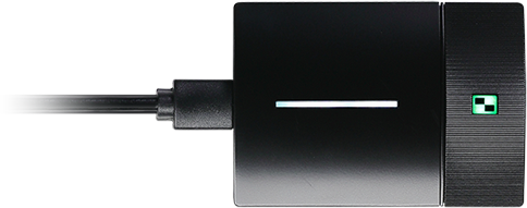
First, I think about the reason for the request. However, PressIT is a simple product with simple functions, so I guess it was difficult to make concrete requests. And circumstances meant that we had to revise the concept and design in the middle of the product planning process. We wanted to create a product that was distinctively “Panasonic” in a field with existing competition. Because functionality is simple, it’s more of a challenge to demonstrate technical superiority. So, we thought to focus on design and pursue the product’s look, feel, and usability. Since it’s intended for use in business and educational environments, we thought that a sophisticated look would be appealing.
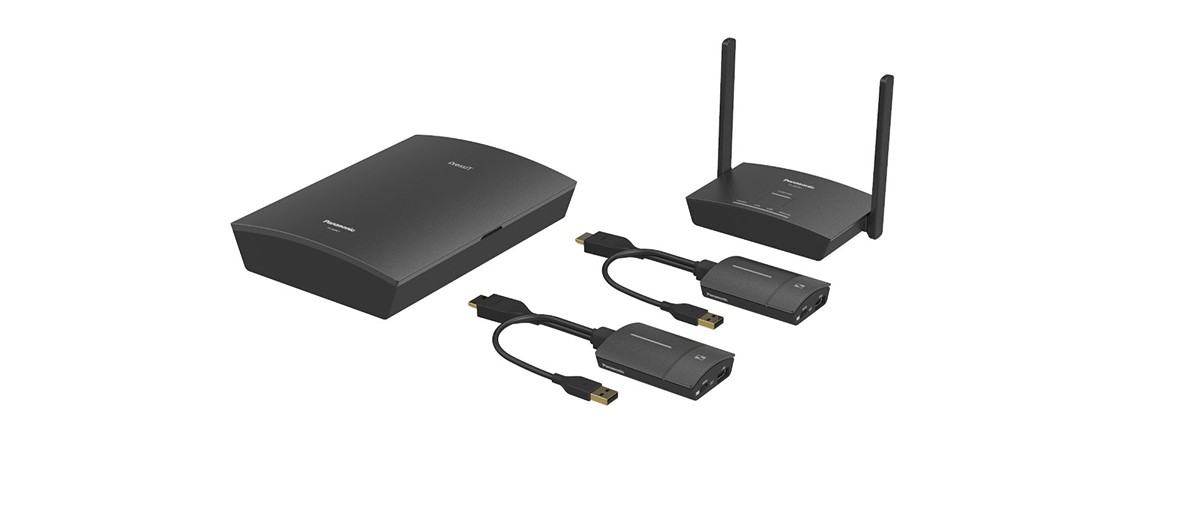
PressIT “basic set” (clockwise from left) consists of a transmitter case, a receiver, and two transmitters. Main button and Sub button have dedicated functions and occupy the whole surface of the transmitter.
You must have guessed as much when you were asked for an award-winning product. Did you compare it with other brands’ product to give it that distinctive Panasonic look?
Takashi Koyama
Yes, we did. After using a few different products, there were some things I noticed. For example, other devices had multiple functions allocated to a single button. Using a single button to perform different functions, such as screen-switching and screen-sharing, for example, made them difficult to understand at first glance. We thought it better to have one button perform a single function.
So that’s why there’s two buttons, Main button for screen-switching and Sub button for Multi Mode.
Takashi Koyama
And then there’s the storage. Even though we’d already provided a case for the transmitters, we anticipated occasions when the case wasn’t being used, based on past experience. So, I originally came up with the idea of a tape-measure-like shape. You could retract the cable inside the body and then stick the transmitter on the whiteboard using a magnet on the exterior. We wanted to get rid of the concept of “storage”. People around me liked it, so we gave it a try. But I couldn’t get the HDMI cable to bend or wind up properly, so it didn’t work as well as I had hoped.
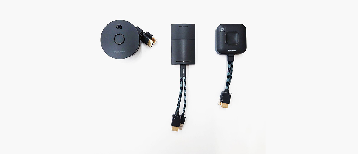
PressIT transmitter prototypes. The circular design on the left is the “tape measure” idea.
How much thought went into the tape-measure idea?
Takashi Koyama
If you include the prototypes where only details were changed, we would have made about 10 to 20. From there, we narrowed it down to about five, then three, and finally one.
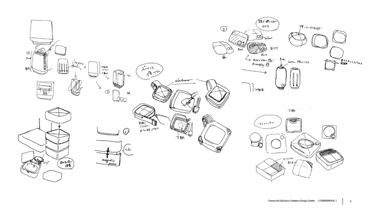
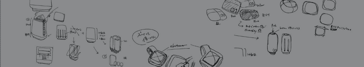
A rough sketch of the design phase. You can see how much experimentation went into various case patterns, the storage concept, and button placement.
How did you end up with a horizontal case?
Takashi Koyama
Other companies use a vertical stand-type case, but they obstruct the screen when positioned in front of the display. In the end, we settled on a flat case, which wasn’t the best in terms of storage efficiency, but it does occupy less space and can be used anywhere. We also envisioned this flat case being used for distributing the equipment during workshops.
Packaging builds excitement
with a Panasonic Blue reveal
Did you consider several patterns for the UI design as well, Mr. Kimata?
Terushi Kimata
Yes. We experimented by building a prototype smartphone app that could replicate the behavior of an actual transmitter, studying button assignment and LED colors. We tried various button patterns, and observed what happened in situations when four people pressed their transmitter buttons.
UI trials were performed with the help of a smartphone app designed to mimic transmitter behavior.
So, press the round button, right?
Takashi Koyama
The round button is a remnant of the tape-measure idea! [laughs]. I had to make it round because of the retracting cable.
Do you make prototypes like this for every development project?
Terushi Kimata
It’s not often I get to build this many of this quality. Even though the buttons on this design are simple, the planned button assignments were complicated. To help me explain difficult-to-grasp ideas, I thought it best to let people experience it for themselves rather than just talk about it.
So, prototypes were used to make the design simpler and simpler.
Terushi Kimata
That’s right. We decided each pattern as we tested. For example, “To activate Lock Mode, press and hold the button until the LED turns blue.” Complicated actions such as simultaneous button-presses and double-clicking were avoided.
Mr. Kimata demonstrates a GUI for a video-conferencing system he helped develop to illustrate an example.
Did you receive some sort of instruction about the logo to begin with?
Haruka Imaichi
At first, a concrete image still hadn’t been decided. The keyword was “sophisticated”.
Another way to say, “Make it look cool”!
Haruka Imaichi
From there, I proposed several design directions such as, “I don’t want cheap, I want soft and friendly,” or, “I don’t want mess and noise,” and then I asked the team, “Which of these would be closest to your image?” I repeated the process, getting people to look at the design proposal. I also suggested we create a representation of “connect” or “wireless connection” and incorporate that in the logo.
That’s something where not only the shape of the letters, but also the color, would be considered?
Haruka Imaichi
We approached color design with Panasonic Blue in mind, but anticipating usage with other products in the future, and emphasizing the PressIT worldview, we matched the UI and product colors.
What was the process for selecting one of these candidate colors?
Haruka Imaichi
We had several things to decide after examining the actual images printed on the product and identifying the advantages and disadvantages of each. In the end, we decided on one after much discussion among all the parties involved.
There are so many factors to consider when making a decision… did you follow a similar process for the packaging?
Haruka Imaichi
B2B product packages aren’t going to be displayed on store shelves, so they’re often just brown cardboard. But for this product, we made sure the packaging was appealing. We aimed to create a sense of excitement when opening it. When you lift the lid of the box, you can see a blue gradation…
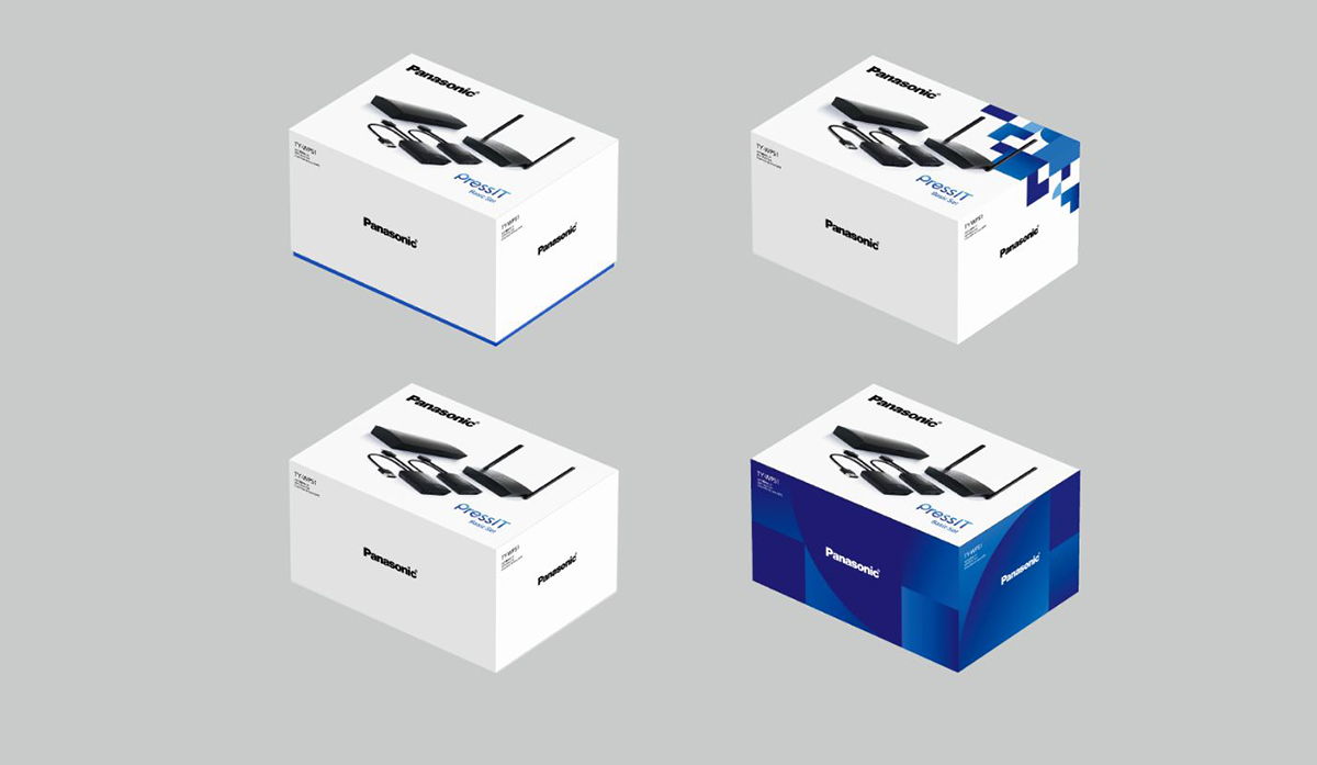
Candidates for PressIT box design cosmetics. After considering several alternatives, the design at top left was selected.
You're right, there’s already blue peeking out from under the lid.
Haruka Imaichi
For the packaging design, we came up with a logo-and-photo proposal and one using just the logo, and talked about it. After hearing suggestions that a key color would help identify it as a Panasonic product, and that it would be good to see what each box contained among many in a conference room, we settled on the current design.
A paradox: good design is invisible
What do you find appealing about working on your designs?
Terushi Kimata
UI design isn’t complimented if it’s executed well. UI design is best when it’s used without being aware of it.
That’s a bit of a shame, isn’t it?
Terushi Kimata
A little bit [laughs]. It’s just that design is not said to be “good” or “bad”, and sometimes products are not used as intended. In that case, I have no choice but to observe the usage scene to see if the user seems to think, “Somehow difficult to use, but it’s okay”. Issues that cannot be expressed in words are important.
Takashi Koyama
I can relate. It’s not until we come up with a hypothesis, show a sample, let the customer touch it, that they realize what the problem was in the first place. For example, we once developed a new remote camera, and a young designer suggested the lens should retract when not in use. “This is cooler and more comfortable.” Surprisingly, it was a hit with universities in North America.
And did it gain a good reputation, people thought it was cool?
Takashi Koyama
That’s not true, in fact, the customer said, “Oh, actually, the janitor turns all the cameras face-down after class.” Apparently, in the West, privacy is so strict that all the cameras are tilted down by hand to show they’re not taking pictures once the class is over. I thought, “It would be nice if they did that automatically!”, and eventually it was commercialized. These kinds of issues seldom come up in business meetings, but I was able to draw them out by using a model and asking, “What do you think about this?” It’s one of the strengths of a designer, and one of the most interesting aspects of this job, this ability to draw out problems that even the user was not aware of, by giving them form.
Haruka Imaichi
I make suggestions for logos and packages that propose solutions to problems also shared by the development engineers, so I’m happy when they’re happy. It’s very satisfying to see people actually using our products.
With PressIT finally out in the world, we’ll finally get to see it in action in the conference room!
Takashi Koyama
Well, I feel nervous rather than excited … we’ll have PressIT in all of our conference rooms as it’s being delivered to customers. If all employees use it, they’re going to be asking me directly, “Why is it doing this?”
- Interview by Masaki Inoue
Promotion movie
Play MovieProduct purchase information
Contact Information